
The box is modeled in Plasticity.

Internal fluting is only included for visible edges.

The model was built with animation in mind, with separate objects for each flap.

Initial test rendering before UV and texture adjustments.

Closeup view of cardboard fluting.

Home Depot PackShip
Bringing Boxes to Life in 3D
After the success of a few special projects, I was invited to help visualize and develop components of Home Depot's PackShip system - their nationwide packaging and shipping operation for online orders. This project combined 3D modeling, texture creation, branding ideation, and rapid iteration across several deliverables.
1. Building the Box
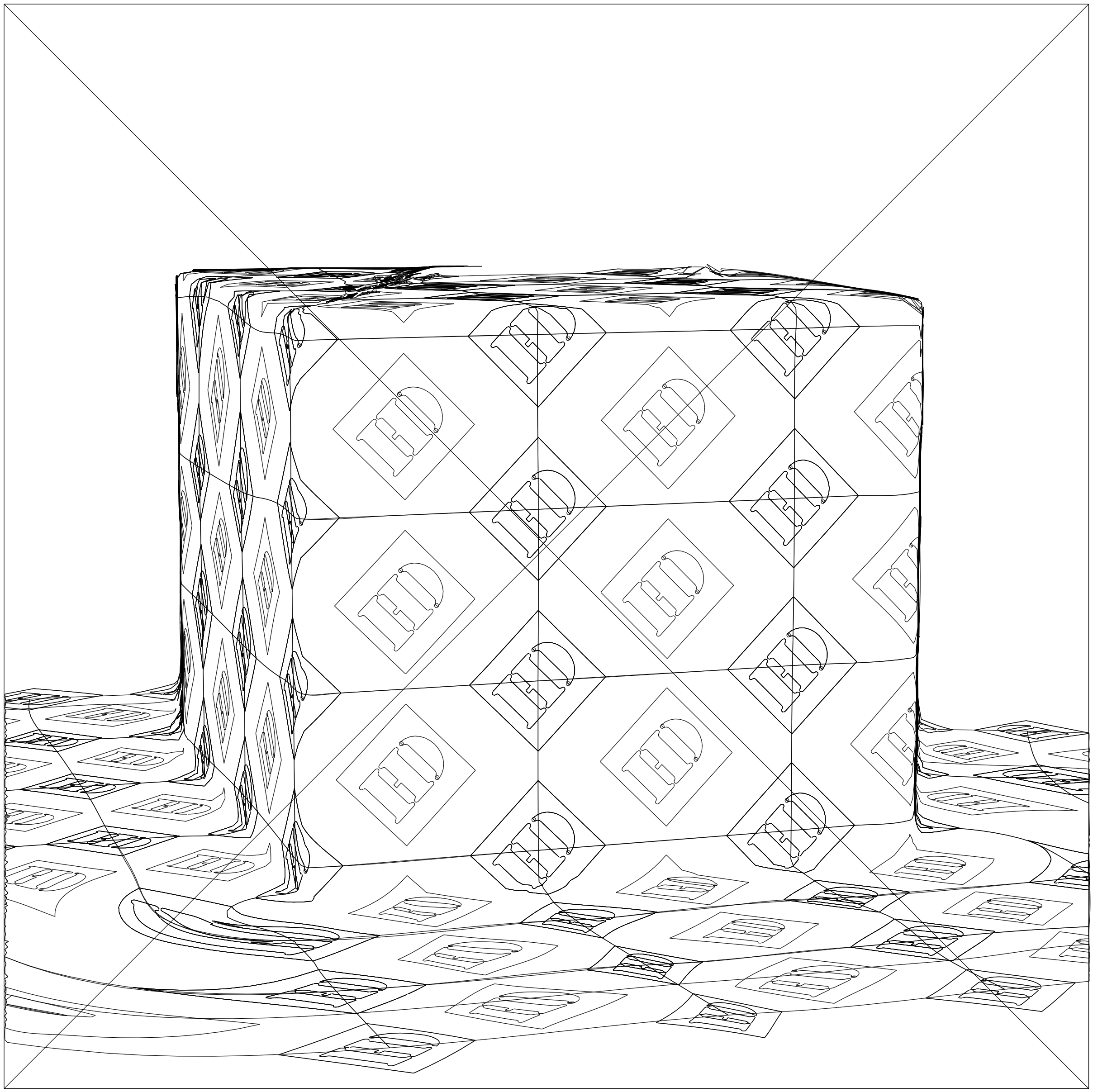
The first request was deceptively simple: create a model of a cardboard box. But this wasn’t just any box—it needed to work for everything from marketing imagery and animation to packaging concept exploration. To render in a realistic manner, it should be accurate down to the internal fluting in the cardboard. Not too literal though. For instance, most shipping of heavy items is done inside double-fluted cardboard, but we opted for a single ply cardboard because that “reads” as cardboard to the general viewer.
I modeled the box in Plasticity with separate side and flap geometry. This allows the model to be flexible for animation. Just a touch of modeling elements will be added where edges meet to give the illusion of flexing paper, which is dependent on how the next person prefers to set up this animation. I made sure this asset was clean and prepared in such a way that other 3D artists can work with it.
I test rendered the box for review of the mesh and the basic form. We ended up making boxes of different proportions, but I built the box with that in mind, so it did not require a lot of time to do.
To prep the model for realistic textures and decals, I used a custom script I wrote to automate much of the UV unwrapping process in Blender. I then sourced and refined a cardboard texture until it looked convincingly tactile under lighting. Once that foundation was solid, I rendered the box from multiple angles and began experimenting with applied graphics.


2. Exploring Branding Patterns
Next, I was invited to explore branding patterns that will be printed onto the cardboard sheets before they’re cut and folded. The process is automated, and boxes are made to several sizes - some of them custom. I tested a variety of design options over several patterning options: some based on grid repeats, others using hexagonal repeats. This was a rapid-fire back-and-forth with a few creative leads, so I built a workflow to match.


If you wrap a large graphic over a small object with Illustrator’s mockup, you can see the mockup deformation by toggling outline view.
First I created some pattern elements, and the remainder I picked up from existing assets. Then I used Illustrator’s pattern tool to generate patterns from these elements, on a variety of grid systems. These patterns were saved as swatches, which make them easier to apply and update. Also, this way you’re handing off files that other creatives can work with easily - an important factor I consider with all of my work.
For the mockups, I used the rendered 3D box as a base, then applied each new pattern using Adobe Illustrator’s Mockup tool. It wasn’t perfect (you’ll spot some minor distortion where Illustrator couldn’t read depth properly), but it allowed for instant visual feedback and lightning-fast iterations. Looking back on this project, I think total iterations including variations came to around 60-70 executions in the course of four business days. So, it was helpful to have a system that was efficient.

Patterns are saved as swatches for easier management and handoff to other creatives in the org.


Exploration: "What if the pattern is inside the box instead?"

Exploration: "What if we developed a high quality branded packing tape?"

Example: The box replacing a commonly used composition that previously used an old photo.
3. Explorations
As usual, if I have any ideas kicking around in my head that seem interesting, I like to take some time and execute those to include in presentations. This is to show how I’m thinking, and to help encourage new ideas that may help to push us out of a cul-de-sac we may not be aware of. So the first thought I wanted to illustrate was…
“What if the branding pattern was inside the box, making the reveal a part of the experience of receiving an item?”

and then…
“If we moved the branding pattern to the inside of the box, maybe the adjustment would be to have packing tape printed (flexography) which would produce slick, high resolution graphics for exterior branding.”

The reasoning behind poly tape printed with flexography (versus major competitor’s printed paper tape) is that it would be more resilient than paper tape (better for heavier packages - common with Home Depot).
We could also design 2-3 variations to be used exclusively within our major demographics. Since the setup would initially be expensive, the production method would make it a very unique touchstone of the brand that other brands wouldn’t quickly imitate - and only large brands could afford to try it in the first place. Maybe think of it as a form of brand currency, of sorts?
4. Preparation for use with collateral
The last thing I did for this constellation of projects was to prepare the box asset for photorealistic rendering as a silhouette image from various angles, lighting and focal lengths so it can then be used in the making of banner ads on the homedepot.com, as well as in online and social media marketing. In some cases, these assets will be placed into scenes of existing photography.*
I refined the texture a bit, made sure the UVs were correct so that the grain of the cardboard flowed in the correct direction - little details like that. Then I took an existing ad that was using an old box photo (one where the photographic element had been duplicated and exported and treated repeatedly) and I positioned the box exactly like that photo, rendered it, and rebuilt the ad so that it did what the original ad did, but with more clarity and control.

The next project will be preparing a set box proportions and scene compositions, and rendering those for production to use in creating new Delivery collateral for homedepot.com and various online marketing.
Takeaway
This was one of those projects where small details, like the number of ply in a cardboard model or the logic behind an unusual workflow, make a difference. But it’s also important to stay mindful of what altitude we’re thinking at so we don’t miss the big picture. I think this balance is an important aspect of being a key player on projects that require effective creative thinking and timeliness.
This project is included on my site because it highlights how nimble prototyping and inventive workflows can move branding exploration forward without waiting for physical samples. It’s a good example of how I like to merge technical precision with creative experimentation.
Though no instant action could be expected on some of my more out there ideas, like inverting the box graphics or making custom tape… I still think it’s important to make these kinds of contributions if nothing else but we can’t help not to. If the environment is healthy for a creative, then the reception is invariably positive - and that has always been the case with Home Depot.
*I’ve made a guide on how to use Adobe Dimension to integrate 3D models into existing photography. It’s one of many guides I’ve created on Home Depot’s internal sharepoint for creatives in the org. Most of my guides either cover unique and interesting workflows, or how to use new systems. I am working on reshaping a few of those into content that will work well on this site.