
Mrs. Fields Cookies – Fundraiser Catalog
Creative Direction • Styling • Layout • Copywriting
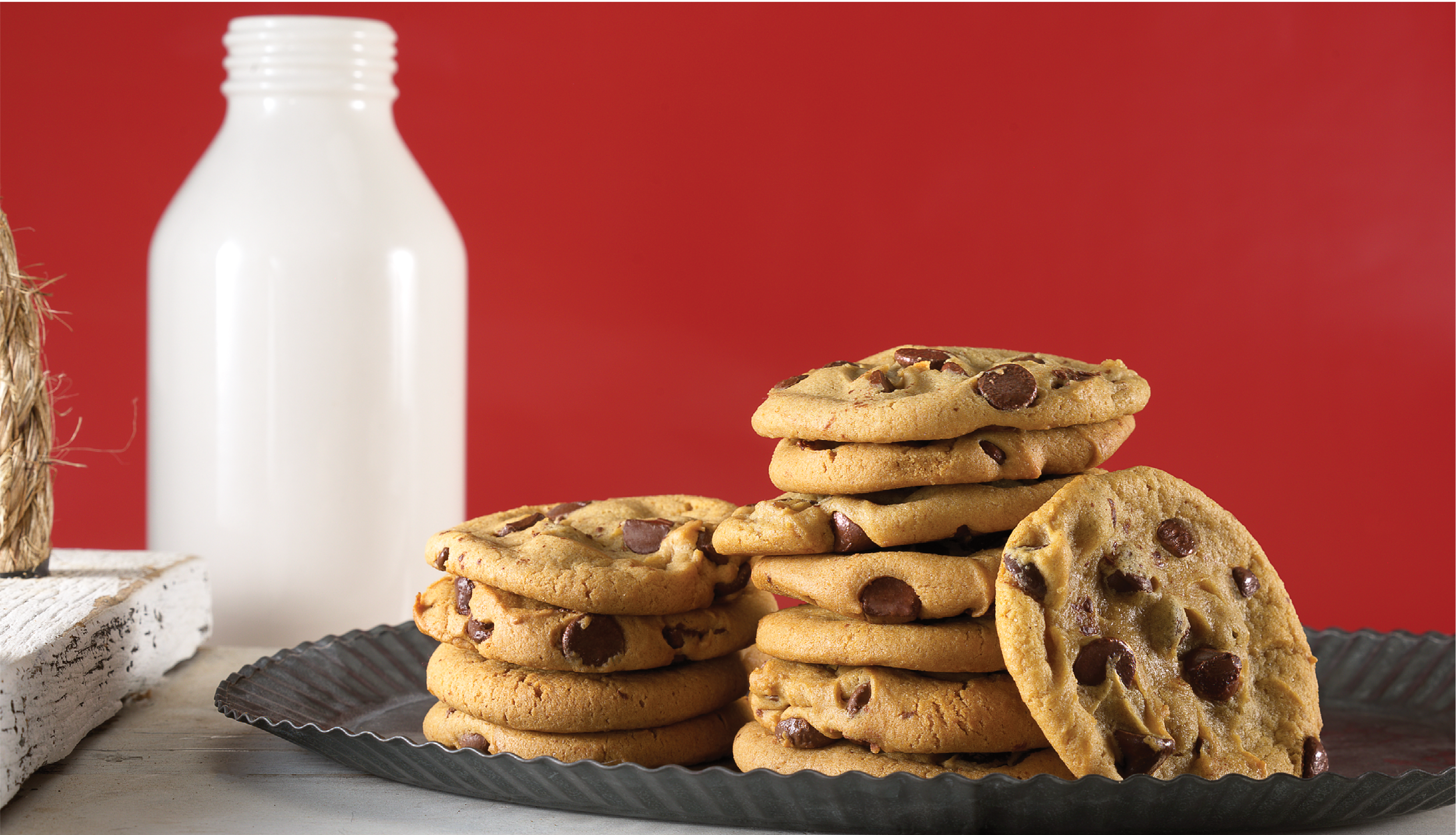
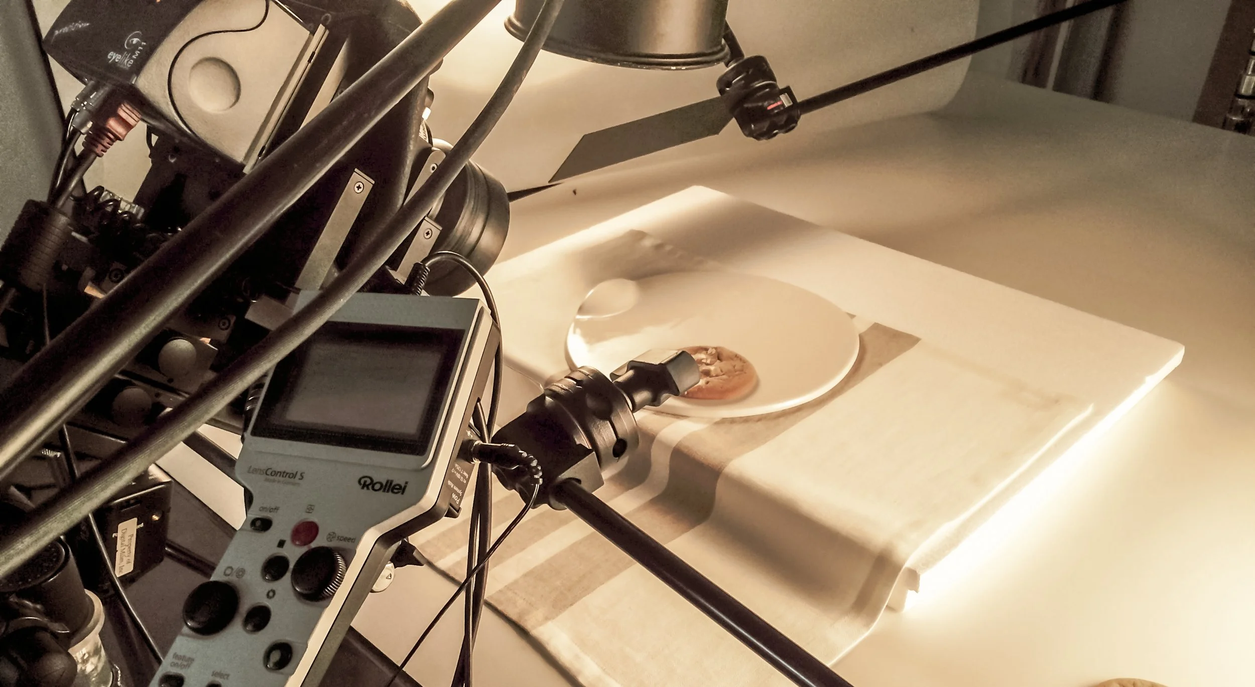
This catalog was a first for me—in more ways than one. It’s not every day that a design project has you baking cookies in a photo studio, armed with antique props and a heat gun. But that’s part of what made it memorable.
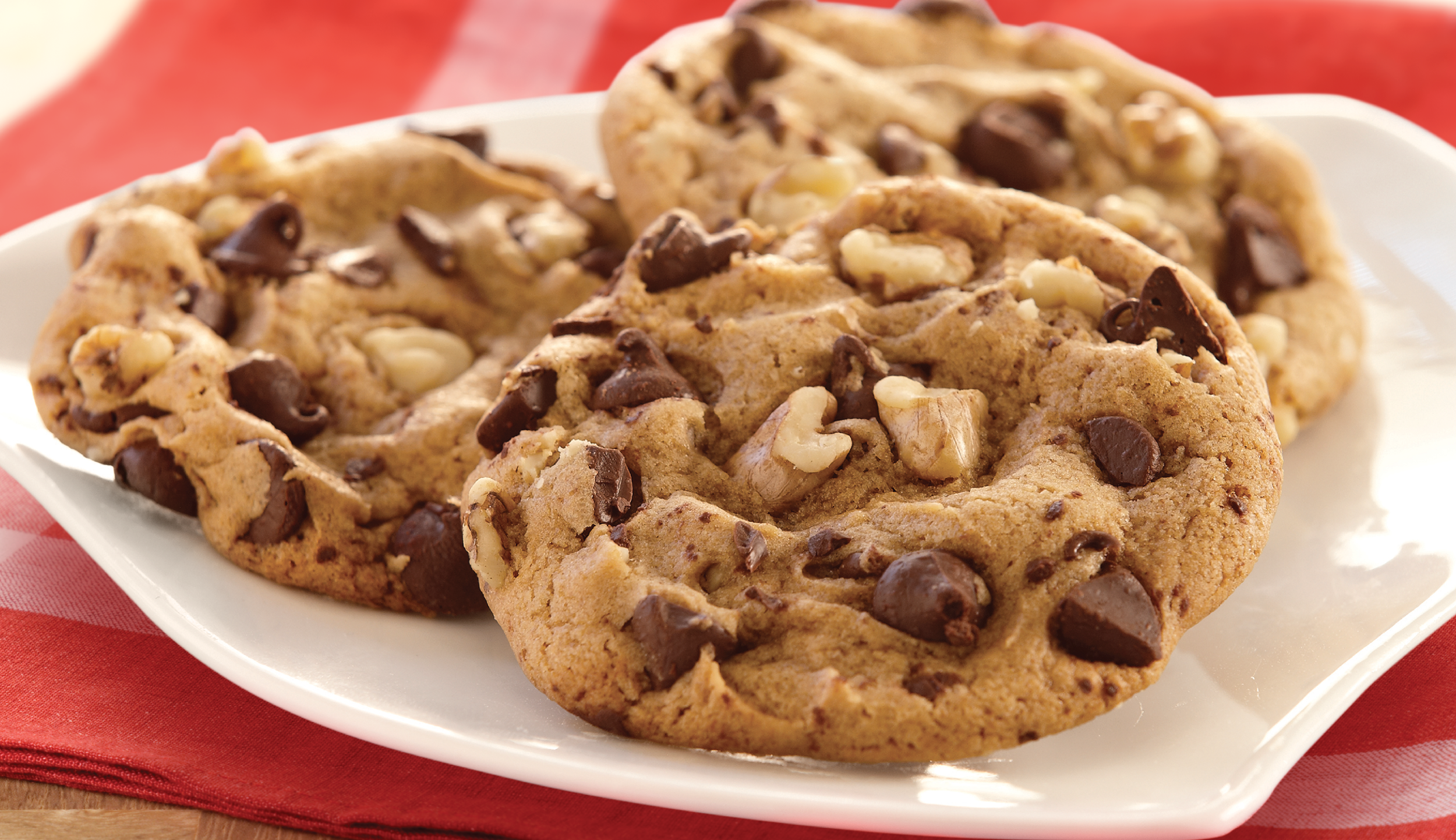
Mrs. Fields is a family-friendly American brand, and this was their first offering for the children’s fundraiser market. I wanted to honor this heritage with a fresh, modern twist on nostalgic Americana. I sourced vintage cookie racks, bakeware, and surfaces from antique marts to set the scene, then worked closely with a product photography specialist to compose and style each shot.
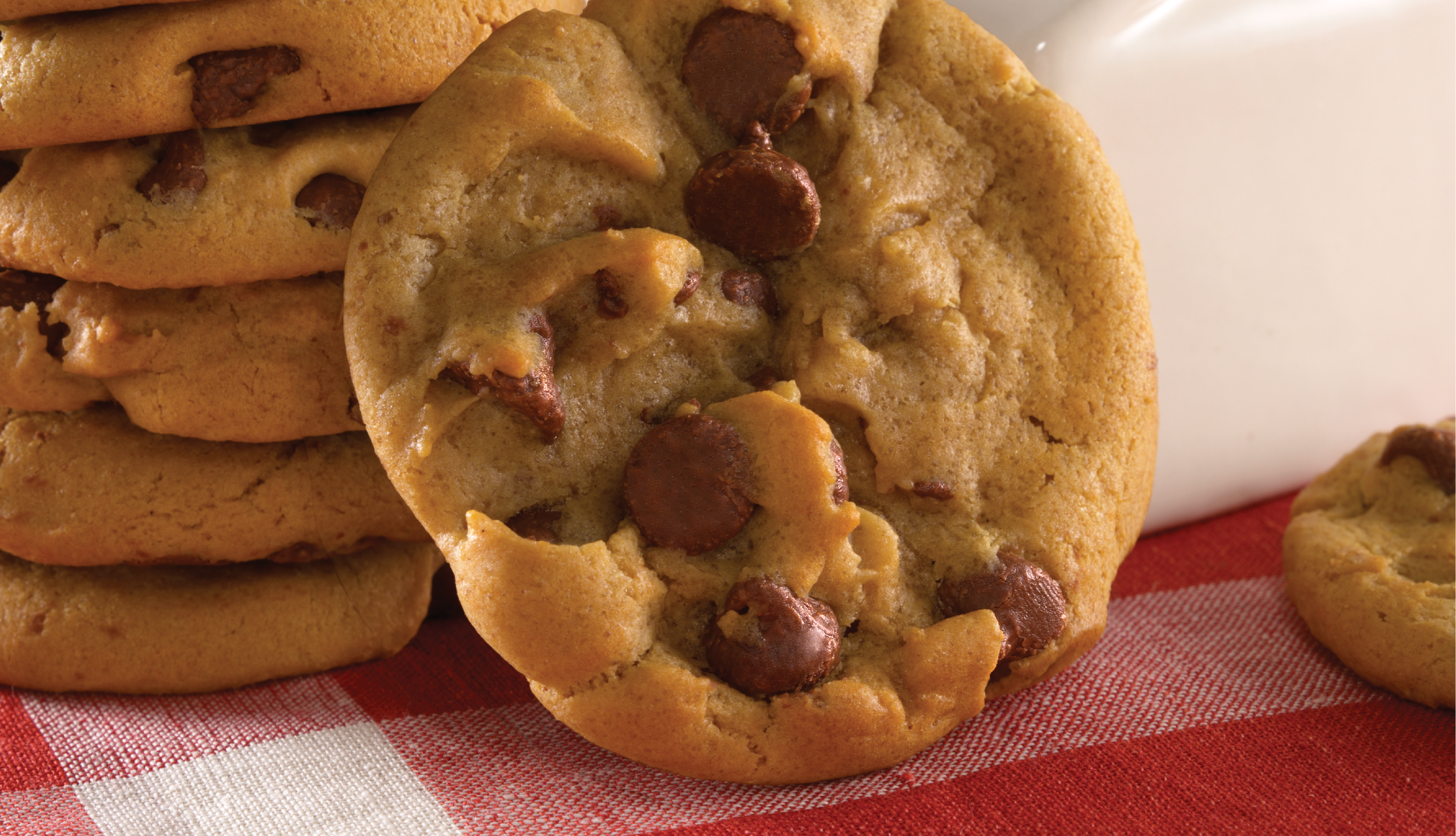
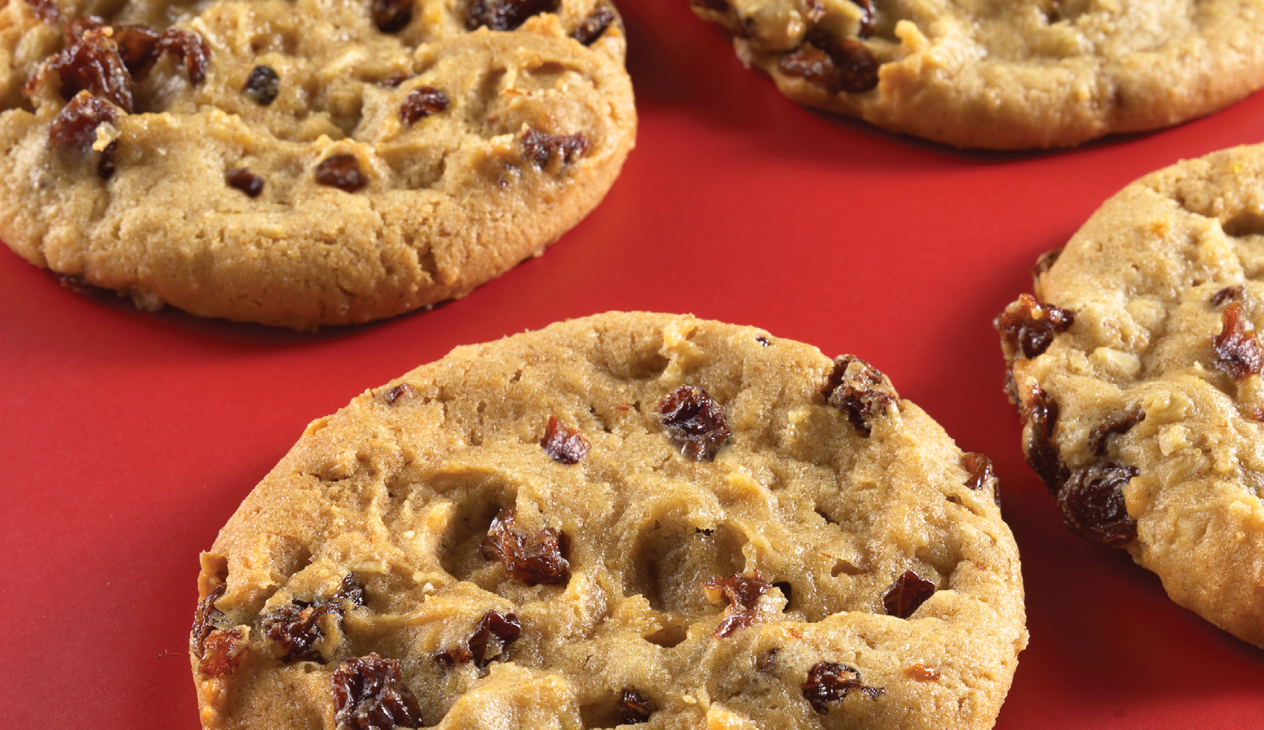
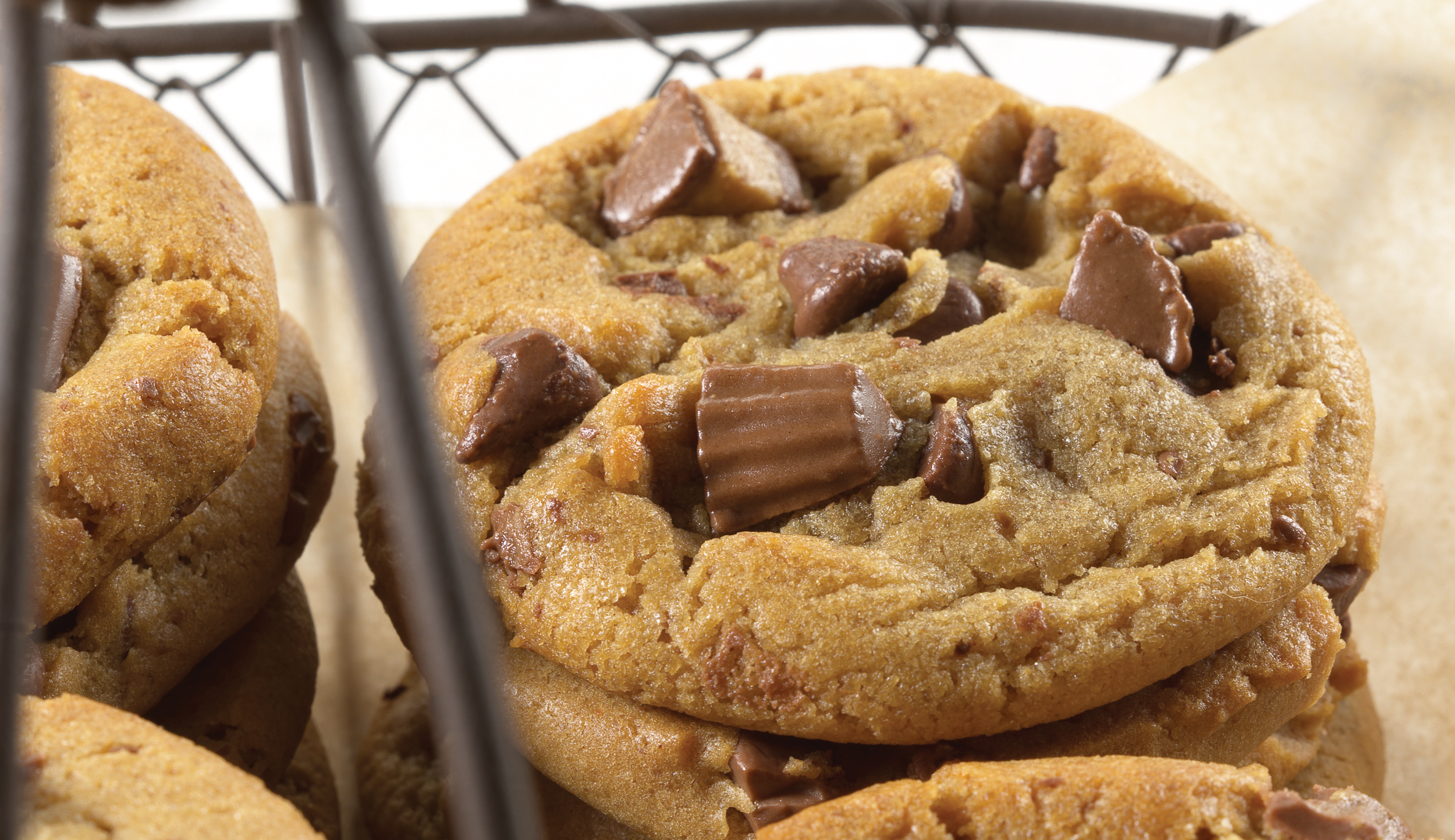
I baked every cookie myself - hundreds of them! Sometimes they wouldn’t look right on camera, and experimentation was required. I ended up underbaking them, then flash heating with a heat gun for a perfect “just out of the oven” look right before capture. For cookies with lots of chunky mix-ins, I’d even recompose the dough by hand to control the way it baked and photographed. Every detail mattered, as every crumb would be meticulously evaluated by the client.
By the time photography was complete, I was already halfway done with layout and copy. The catalog had a high product density, so balancing visual breathing room with strong product visibility was key. This required a good bit of iteration to work everything into a refined aesthetic that measured up to my original vision.
To help reduce the harshness of what I call “over-rectilinear design” I leaned into a warm red, white, and tan palette that echoed tones in the Mrs. Fields brand, and developed graphic elements to transition between in-shot tones and typography. Even with all of this interplay, I wanted the catalog to exhibit an airy, contemporary tone. I was reaching for a cohesive aesthetic, like an editorial catalog with a sense of style.
This was one of several catalogs I created for various fundraising companies through Starke Design, and it remains one of the most creatively demanding (and fun) projects I’ve done in the realm of catalog work. There was a lot to juggle with prop sourcing, styling, baking, art direction, layout, and writing.
I mainly wanted to feature this book as a representation of the catalog period of my career, 2005-2015. This is where I developed a sense for retail typography, and a principle of continuity that diverges from the production artist’s perspective of that theme. To me, consistency is in the wit. It’s not about having the same graphic elements, featuring the same exact specs and appearing in the same x/y coordinates on every page. Inspired consistency is a delicate balance, an interplay of aesthetic and organic sensibility. In the context of the retail world, it is inspired play that evokes interest and desire.