
Exploratory Logo Design Rooted in Material Thinking
POURman, also presented as POUR, is a brand concept developed by a group of bourbon enthusiasts in Atlanta. These individuals—connected to multiple Southern distilleries—are crafting a unique bourbon tasting experience that rivals even the most celebrated wine regions. When they approached me, the business was in its early conceptual phase. What stood out immediately was their depth of knowledge and passion. Our first meeting wasn’t a pitch—it was a journey. They guided me through a curated tasting, using the process as a lens for discussing identity, sensory storytelling, and brand experience.
That conversation became the seed for the brand’s visual direction.
The name POURman is a play on words—referencing both the financial indulgence of being a bourbon connoisseur and the act of pouring itself. From the outset, I was interested in exploring the tension inherent in this contrast: luxury / humility, craft / excess, form / function.
click image to enlarge…
Inspiration by Material Limitation
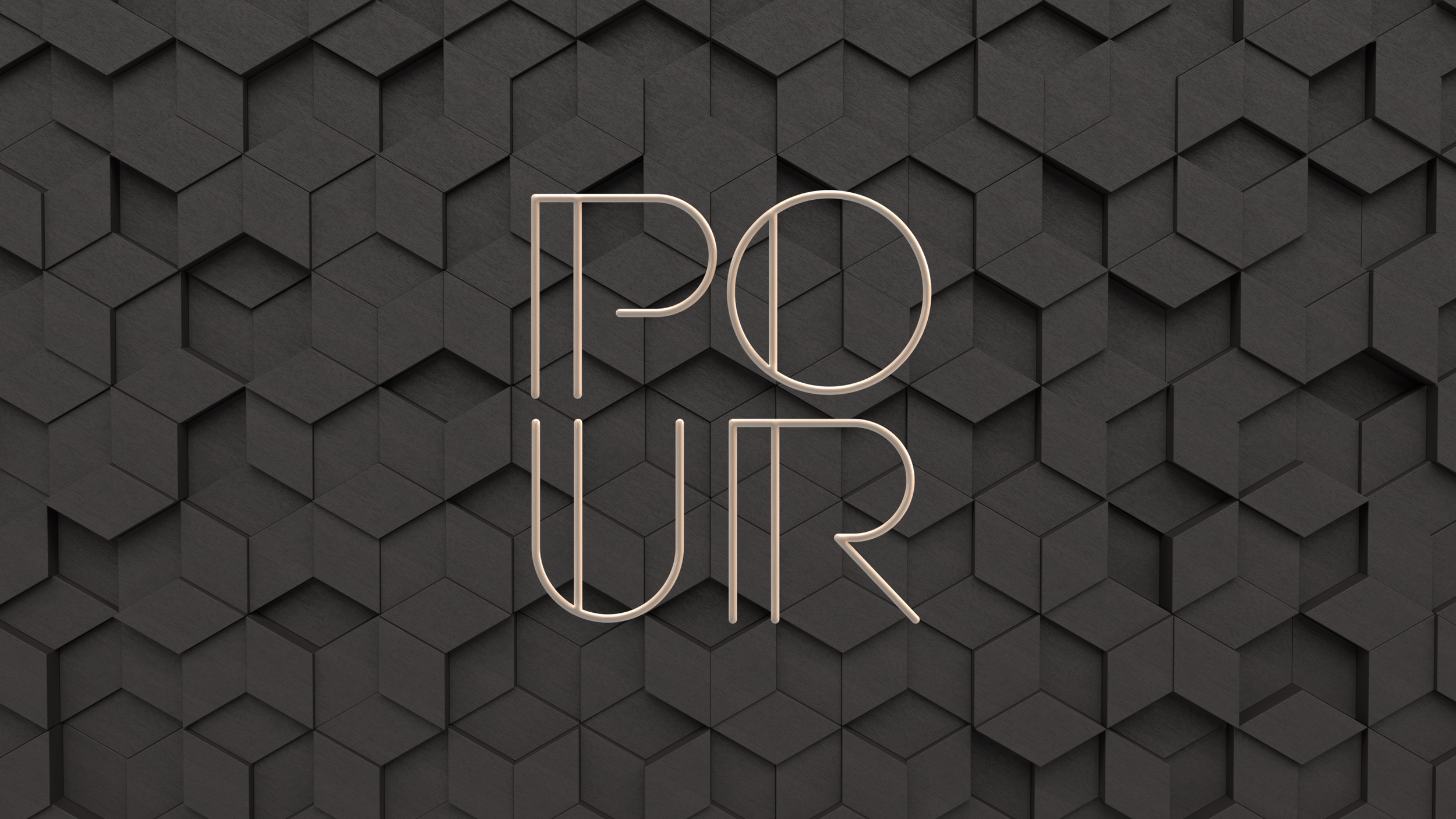
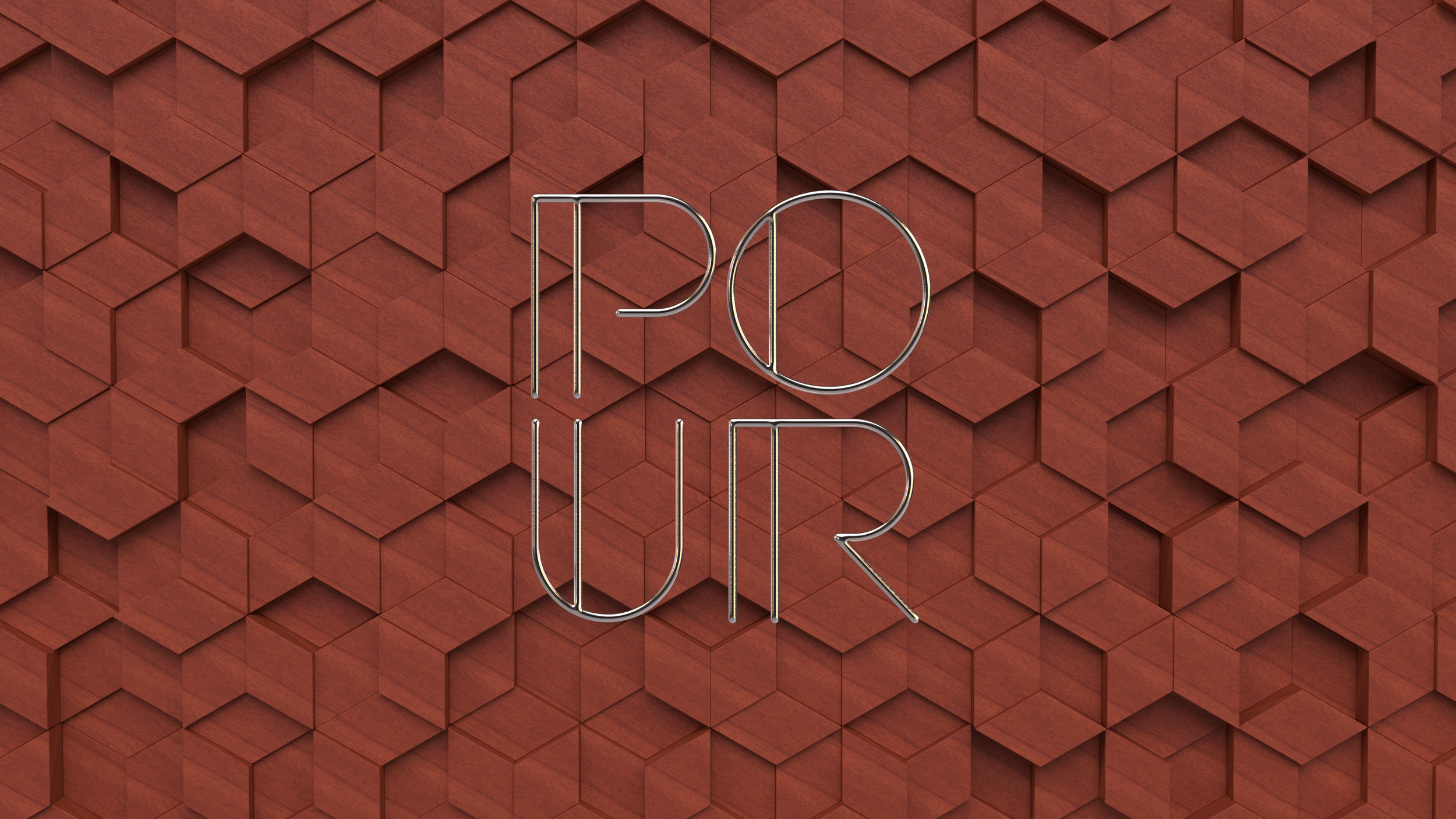
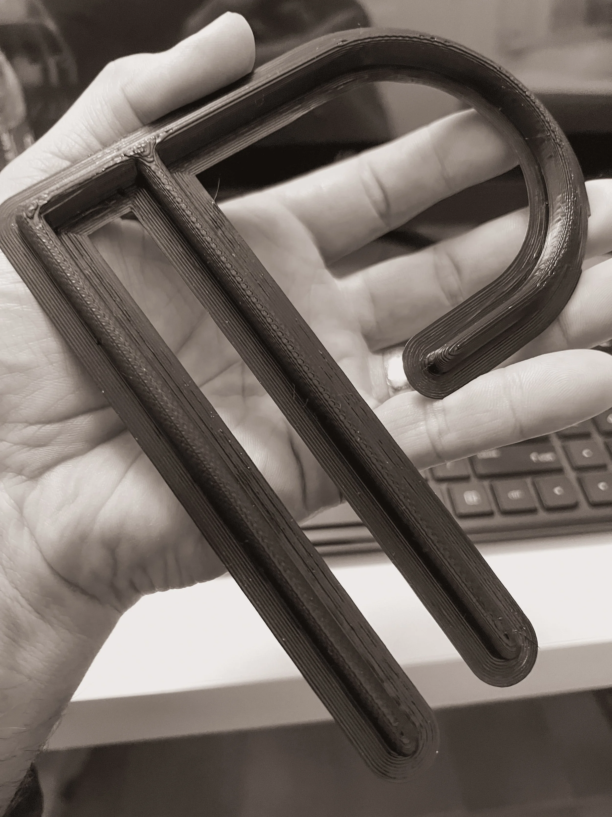
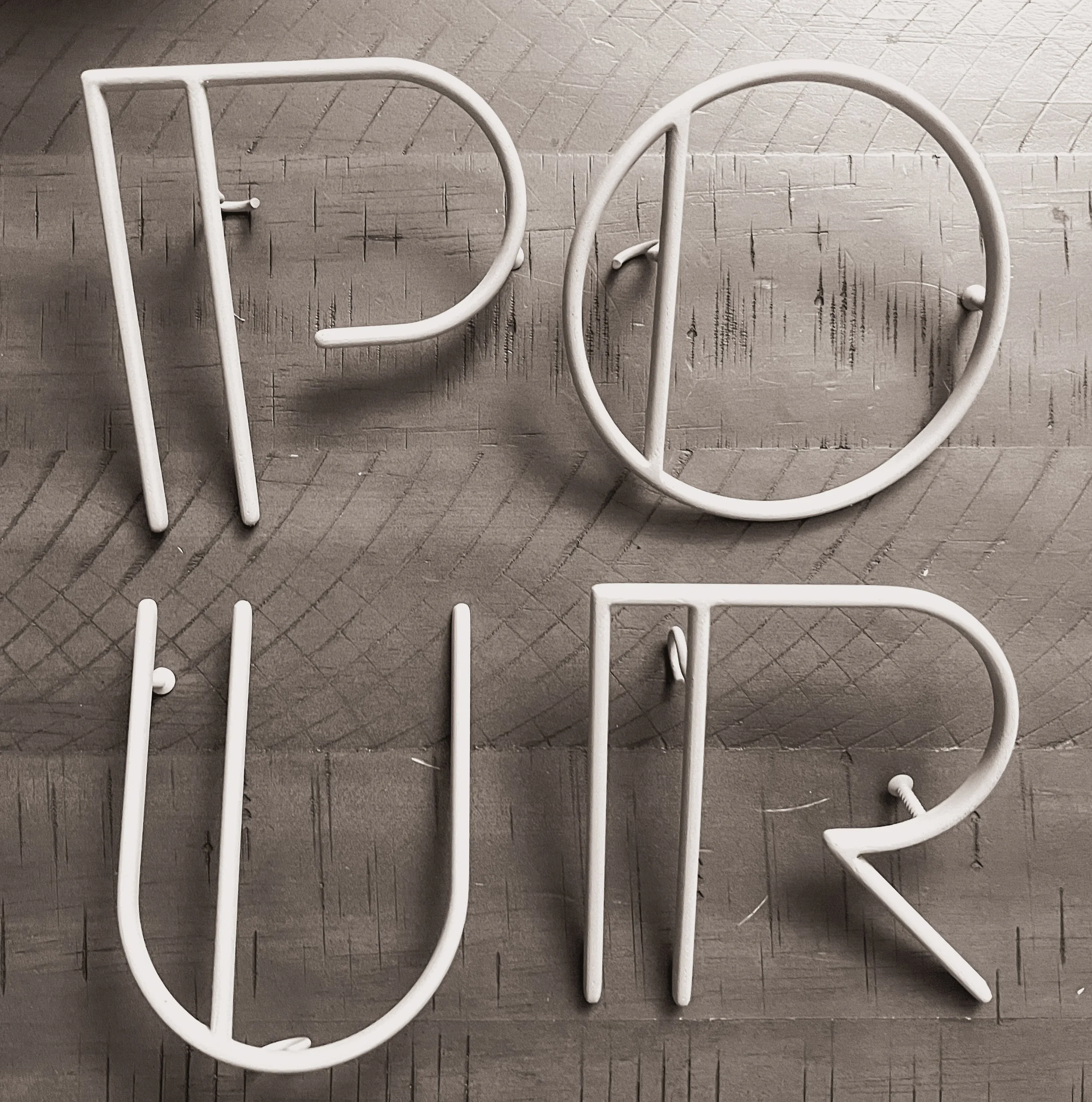
Instead of starting with typefaces or sketches, I approached the logo as a sculpture. I imagined what the letterforms would look like if it were formed from something tactile—something elemental. I began experimenting with physical materials and shaping methods that might naturally lend themselves to an Art Deco aesthetic.
Copper emerged as a central material early in the process, alongside richly figured hardwoods—elements intrinsic to the bourbon world. I began prototyping with heavy-gauge copper grounding wire, shaping curves and angles by hand, and testing the feasibility of physically constructing the letterforms by shaping them around 3D printed bending forms.
Eventually, I moved into 3D modeling, shaping the letters via vector backbones in 2D and extruding them in Plasticity using roundovers and circular profiles to mimic the wire’s natural form. These shapes were further refined, exported, and rendered into environmental concepts that speak to the warmth, depth, and material inspiration we’re striving to achieve.
click image to enlarge…

Flexible Identity System
Rather than force a single version of the logo into every context, I’m developing a responsive identity system that is still in it’s infancy. The broad strokes are there though: In large, architectural applications, only the core letters—POUR—are used, emphasizing simplicity and impact. For printed collateral or digital contexts that require more clarity, the full name POURman is used.
The primary logo exists in a square configuration, optimized for prominent placement. I created rendered 3D environments to showcase how the mark might exist in real architectural or packaging contexts, drawing inspiration from both Art Deco interiors and the textured elegance of hand-finished metalwork.
Even the domain is attenuated by this interplay, as it reads like a phrase, rather than just the name itself: thepouringman.com (site is not live)
Results
The logo has been approved with enthusiasm, and the team looks forward to working more on the brand and developing the website. The company is still pre-launch, and the site is expected to launch in late 2025. This identity system has already begun to grow legs: it tells a story, and makes a unique impression on audiences while the concept percolates into awareness in a way that is ideal - just slowly enough to make it memorable.
To me this work reflects a process grounded in curiosity, in materials, and in building something that is shaped by a unique set of parameters. I’m very pleased with the results and look forward to working with this brand more in the future.
Interactive
Below is a 3D interactive of the POURman logo.
Drag to orbit, pinchor scroll to zoom.